RG
Timothy Malone Wines
A site redesign for a winemaker based out of Willamette, Oregon. The current site is dated and after conducting some customer research, I presented three modern designs.
Wine reflective of a time and place.
The Problem
The current site is need of an update since it’s dated in style and functionality. The site is not responsive on mobile devices leaving a rather poor experience for customers. I conducted a user survey to find out what potential customers would like to read about on the site and over 87% of them either wanted or might want to read about wine pairings.
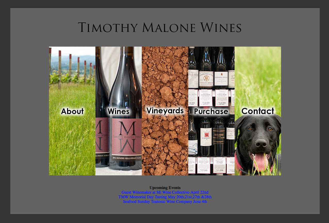
Current Site
The Solution
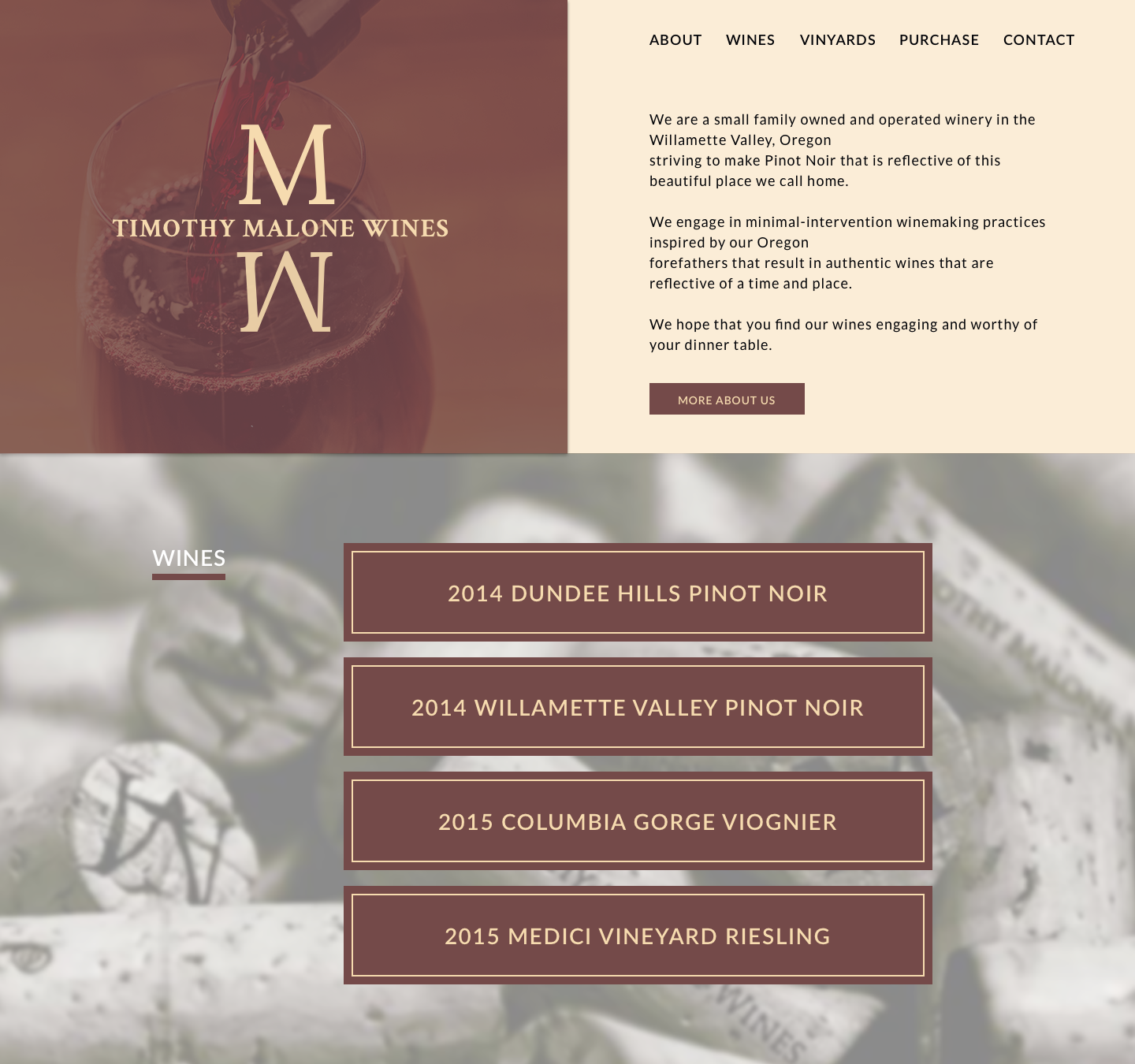
I researched current design trends and came up with a few layout options that I felt allowed the site to breathe while presenting the winemaker in a classy way. This is the design that tested the best.
The Process
Competitive Analysis
I researched other winemakers to get a sense for what their sites looked and felt like. I found that they typically had a classy look with images from their winery. I found most of the layouts rather generic so I designed a layout that I thought would stick out a bit while still having a clean and classy way.
User Survey
I conducted a user survey to learn about wine drinkers’s habits surrounding how much they research wine, what the look for when they go to wine sites.
Here are a few of the key insights gained from the survey:
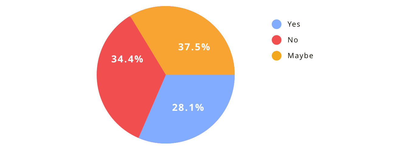
- 71.9% of the respondents either don't know or only know a little about pairing wine with food.
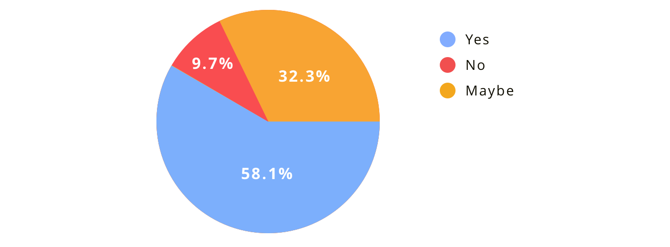
- 90.4% of the respondents either would like or might like advice on wine pairing wine with food.
- 96.9% of the respondents typically drink wine with food.
- Almost half of the respondents are interested in learning about a winemakers process.
Do you know how to pair wine with food?
Would you like advice on how to pair wine with food?
User Stories
With an understanding of our potential customers, I created a list of user stories documenting how users would engage with the site.
| Role | Task | Page | Action |
|---|---|---|---|
| A User | I want to learn about all the Timothy Malone | About | Main Nav link, Action link and Footer link |
| A User | I want to read about the wines | Wines | Main Nav link, Action link and Footer link |
| A User | I want to read about the vinyards | Vinyards | Sign Up for Blog Updates |
| A User | I want to find out where I can purchase the wine | Purchase | Main Nav link, Action link, and Footer link |
| A User | I want to learn about wine pairings | Pairings | Wine page link |
| A User | I want to purchase a report from the Services page | Services page | Purchase Report link |
| A User | I want to contact the wine maker | Contact Page | Main Nav link, Action link, and Footer link |
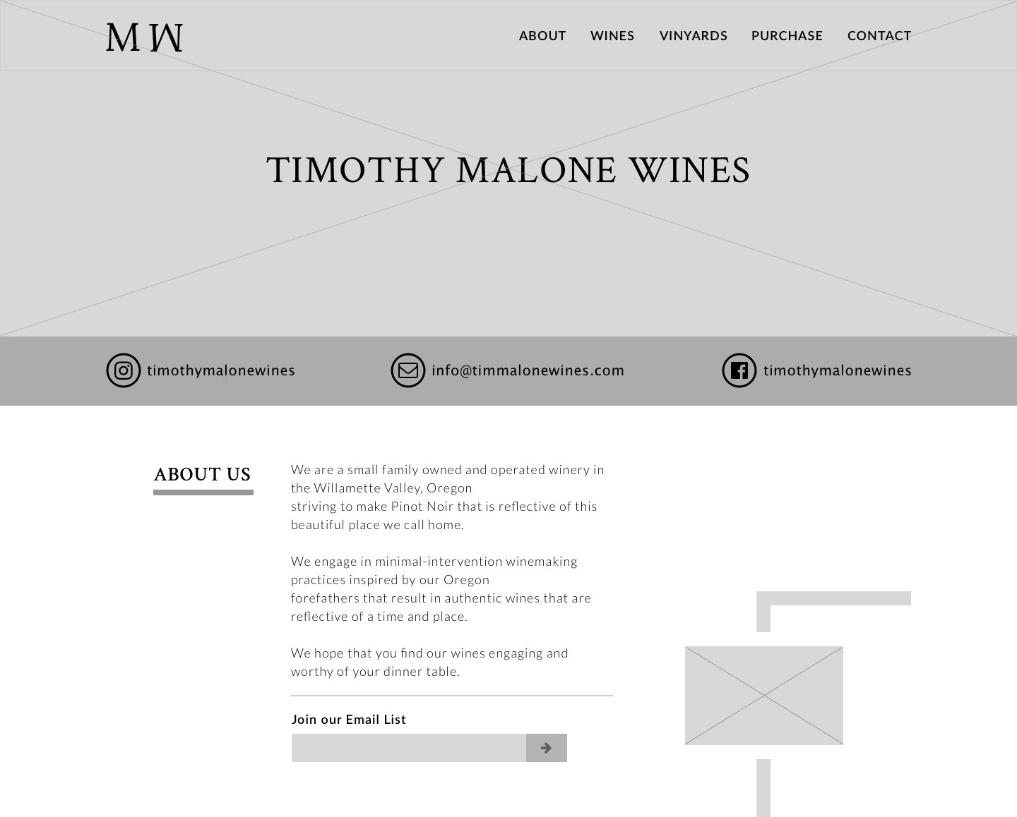
Wireframes
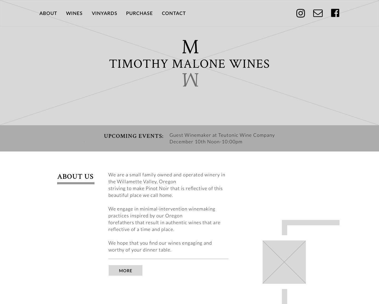
Wireframe Type 1
I came up with a few layouts that I felt captured a vintage wine look reflective of a time and place.
Wireframe Type 1 variation
Used an upcoming events bar instead of the email and social media links. I moved the social links to the top navigation bar. I also removed the join email list input.
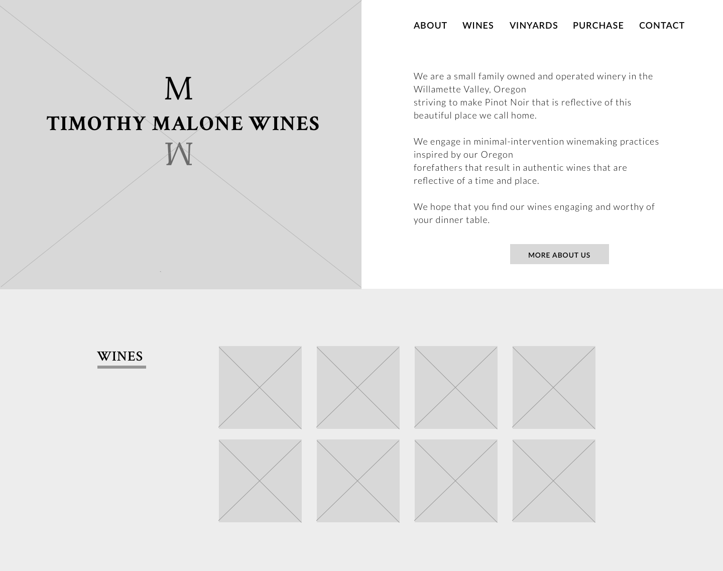
Wireframe Type 2
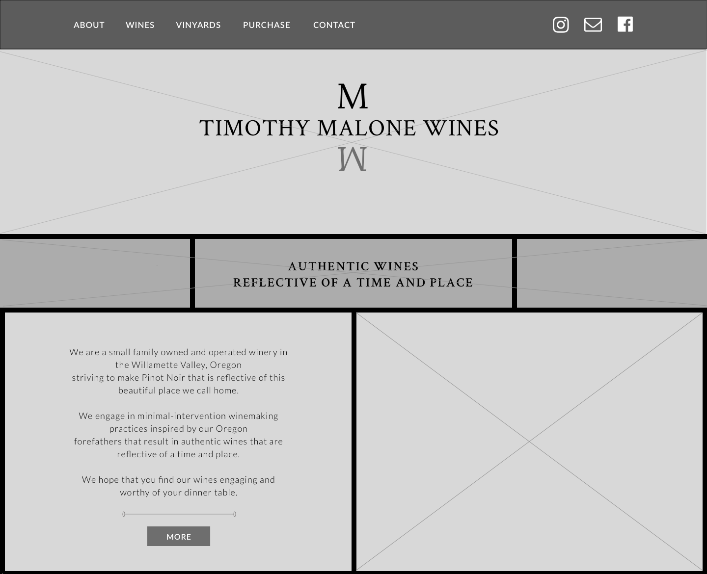
Wireframe Type 3
I added bold borders below the hero and background for the to navagation.
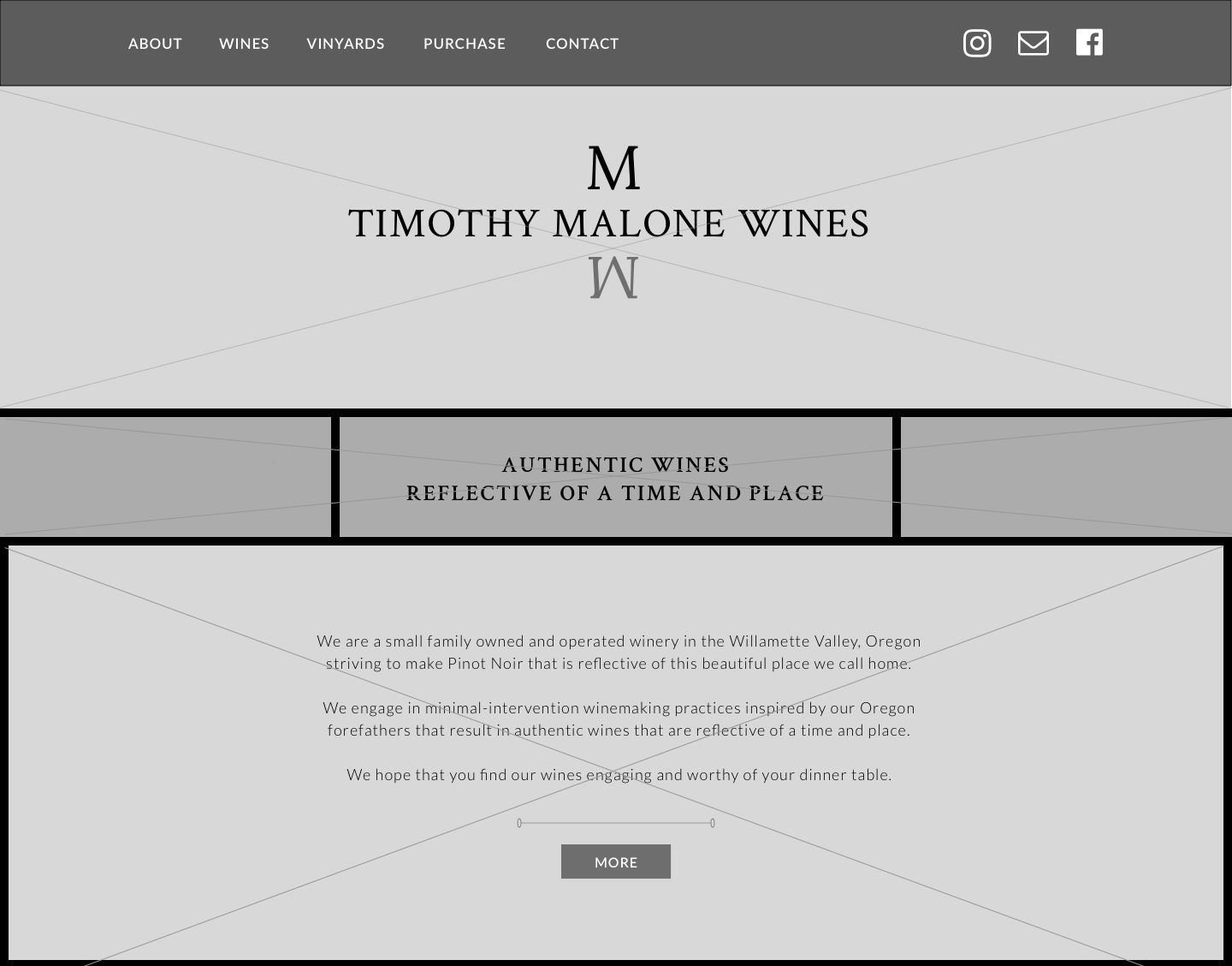
Wireframe Type 3 variation
I moved the image next to the winery information and put it behind the information centering it on the page.
Mockups
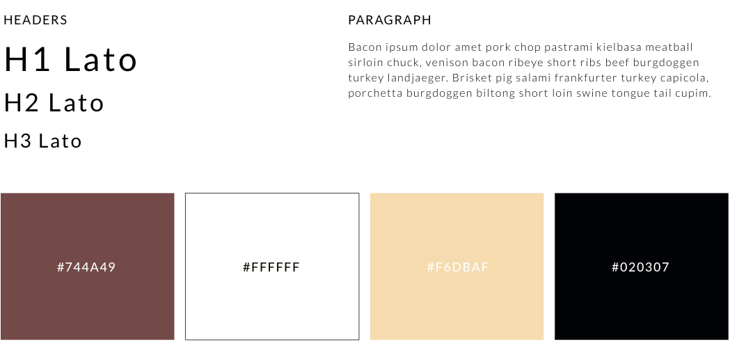
Typography
Timothy has a serif font for his logo so I decided to pair it with a san serif font. I chose Lato because it’s friendly, warm, and sophisticated.
Color Psychology
I decided to flip the yellow and black that Timothy has on his label because the yellow stands out better on top of the burgundy color. Other than that I stuck with Timothy's color palette.
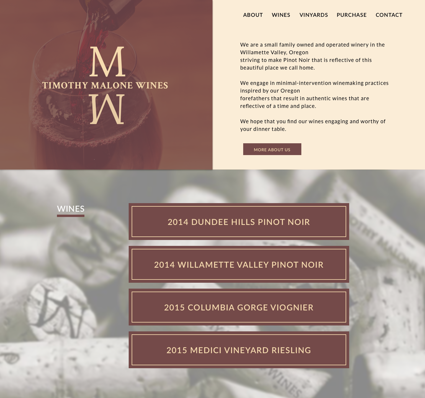
Mockup Type 1
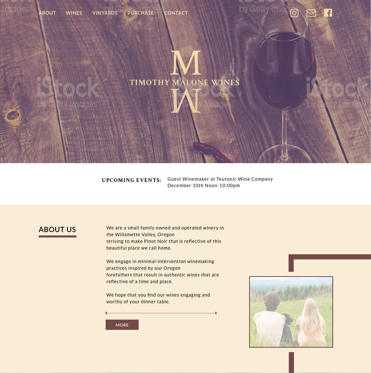
Mockup Type 2
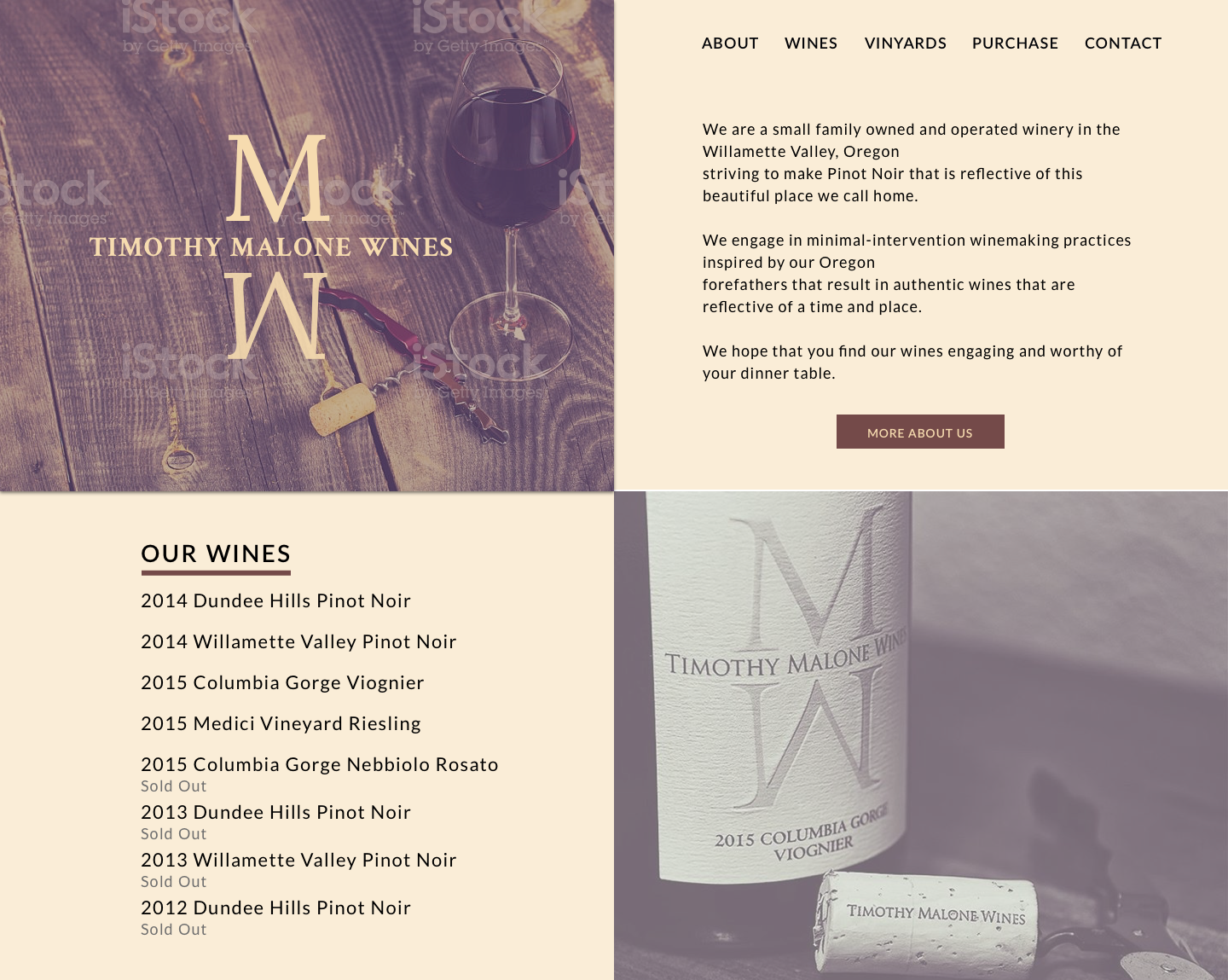
Mockup Type 3
Conclusion
When designing this site I learned that it’s ok to break away from the traditional design grid. Breaking from the grid can give life to the design. With a development background, I did this with caution thinking about the development time and knowing that a functional site is a priority.
When designing the mockups my initial favorite wasn’t the design we ended up going with. I initially thought wireframe type 3 would be the best one because it was a new type of design for me and it felt fresh. I learned that you shouldn’t get too attached to a design and that alternative designs help you and your client make better decisions on what is the best design for the project. We ultimately decided on mockup type 2 because the story of the winemaker is important and we felt it should be one of the first things users read about when landing on the site.
The user survey indicated that wine pairings would be of interest to the respondents. This is something the winemaker is considering adding after he finishes bottling his latest release of wines.
The homepage designed using Sketch and built using HTML, CSS, and Javascript. It is hosted on GitHub.