RG
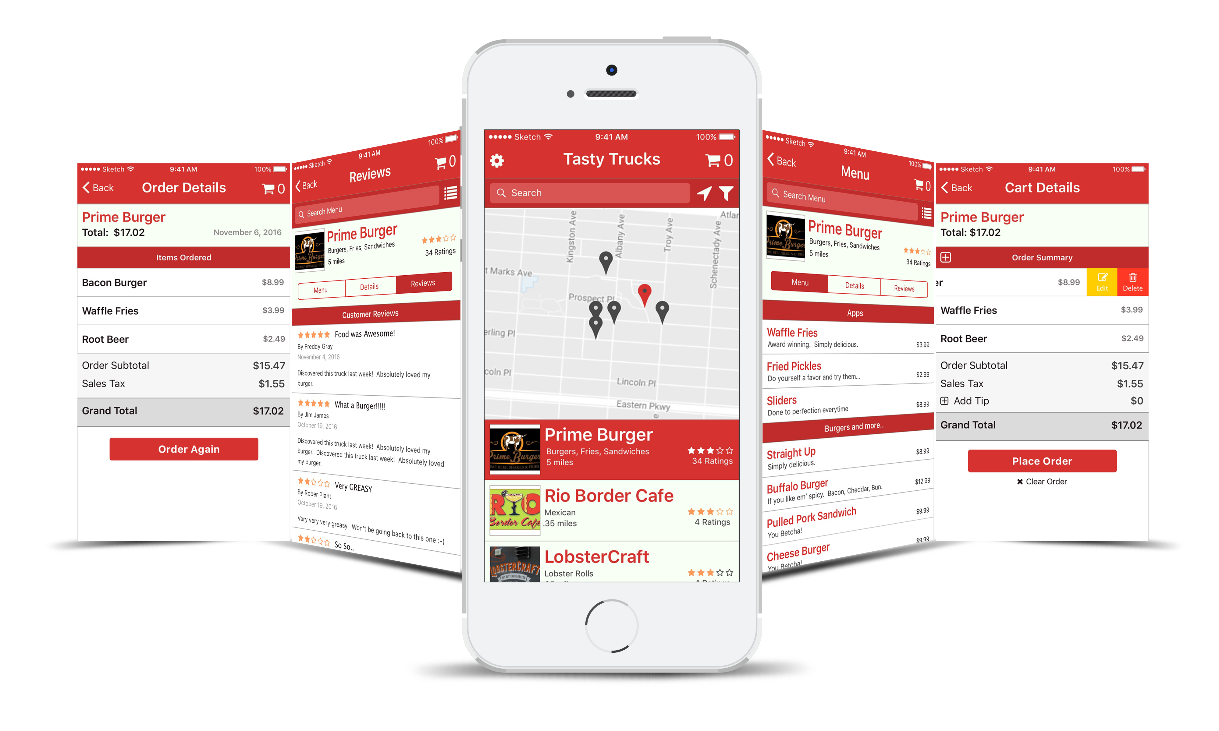
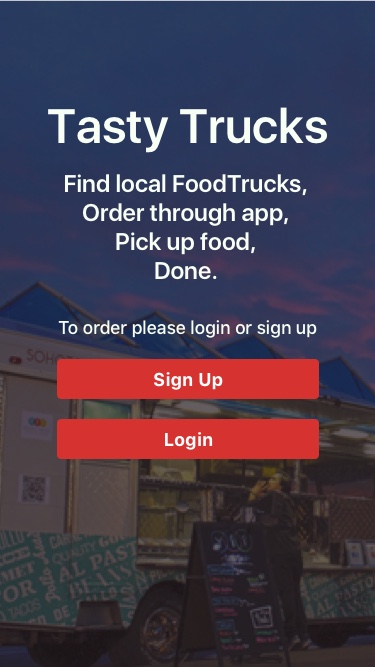
Tasty Trucks
A design for an iOS application that allows customers to find food trucks near them, view a menu, select items for purchase, and checkout.
Find local FoodTrucks, Order on app, Pick up food, Done.
The Problem
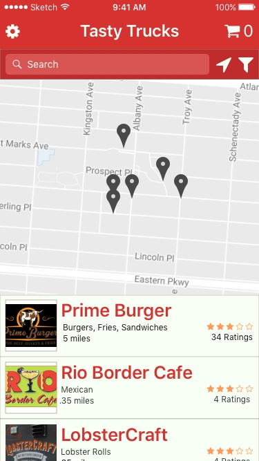
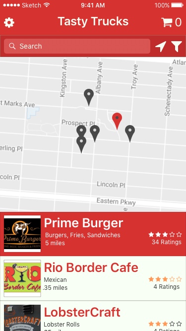
Often times we want to eat from a food truck, but we don't want to wait in their lines or we need to find trucks that are near us. Tasty Trucks is an iOS app that lets you search for trucks near you. The app lets you browse menus and make a purchase so your food is ready for you.
The Solution
I researched mobile apps in the food delivery sector. The GrubHub app inspired the design for Tasty Trucks.
The Process
Competitive Analysis
When I researched food delivery apps I looked at their features and for UI patterns.
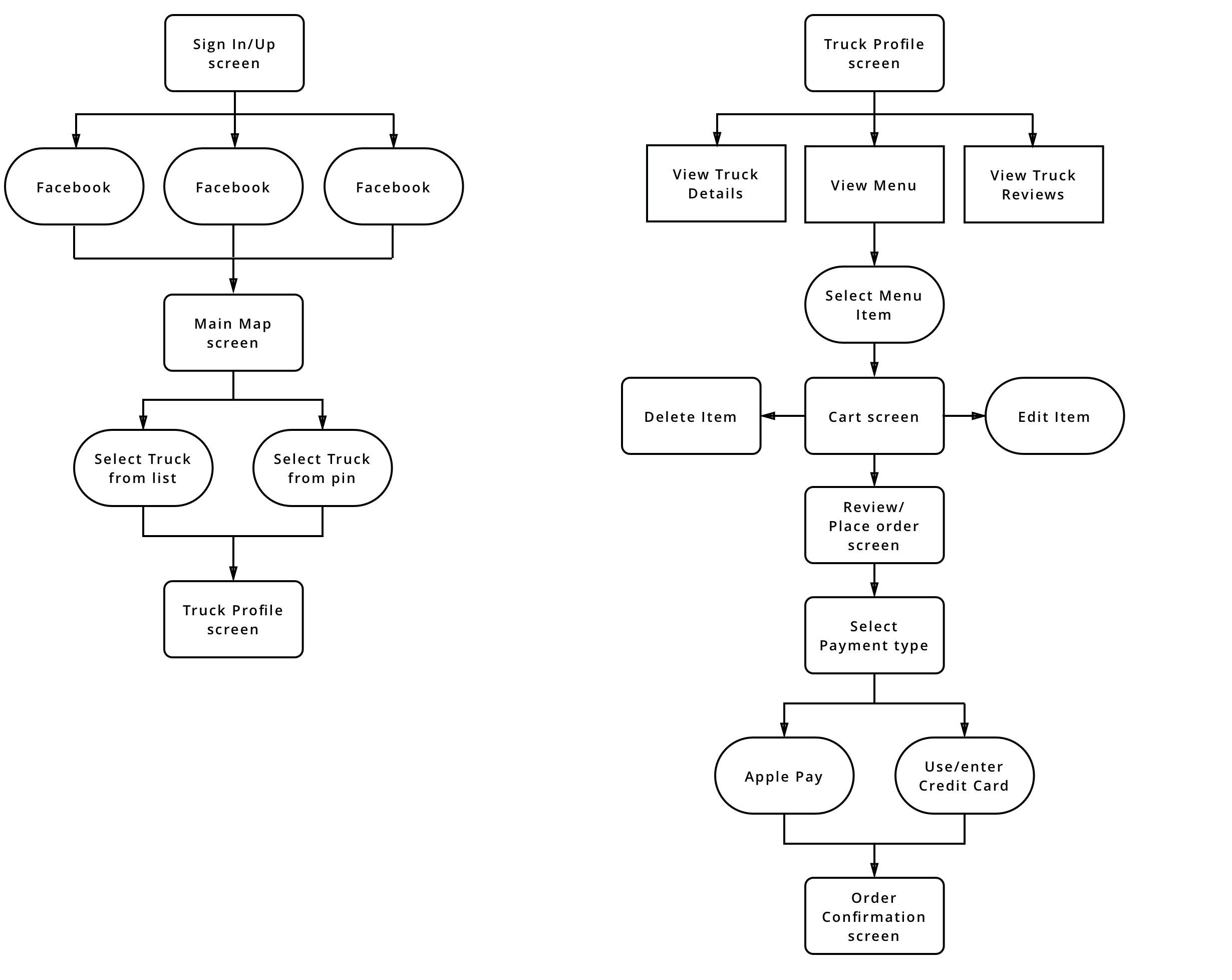
User Stories
I created a list of user stories documenting how users would engage with the site.
| Role | Task | Screen | Action |
|---|---|---|---|
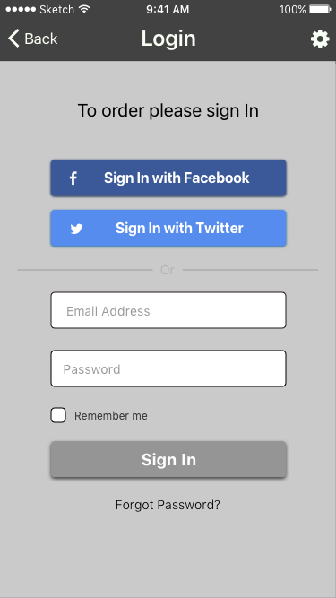
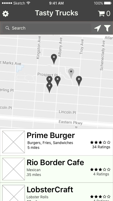
| A User | I want to find food trucks near me | Landing | Landing screen after login or signup |
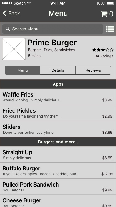
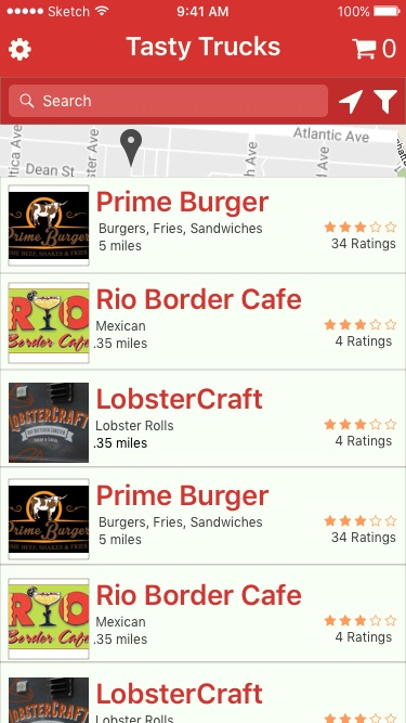
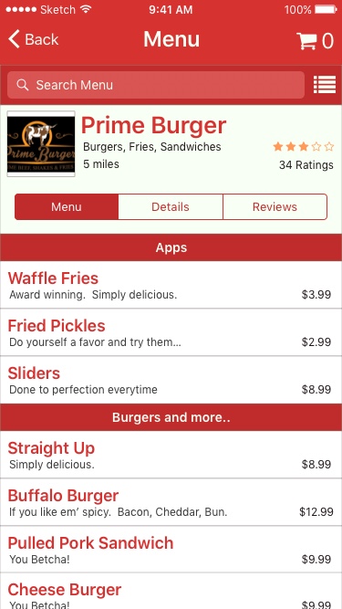
| A User | I want to look at a trucks menu | Truck Menu | Truck list link and Map Link |
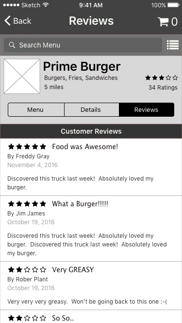
| A User | I want to read truck reviews | Truck Reviews | Truck page reviews link |
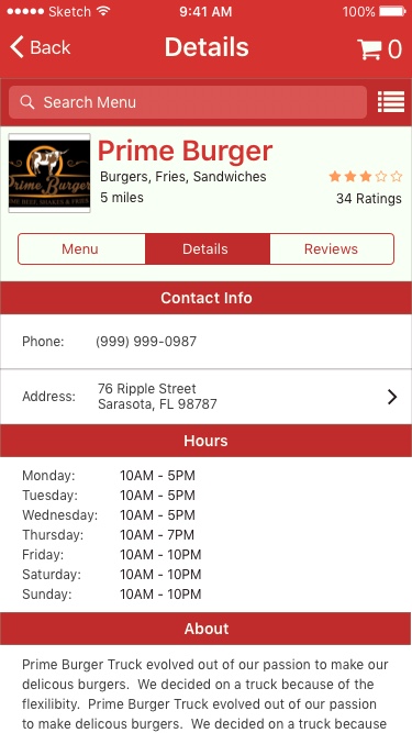
| A User | I want to read about the truck and find out it's hours | Truck Details | Truck details link |
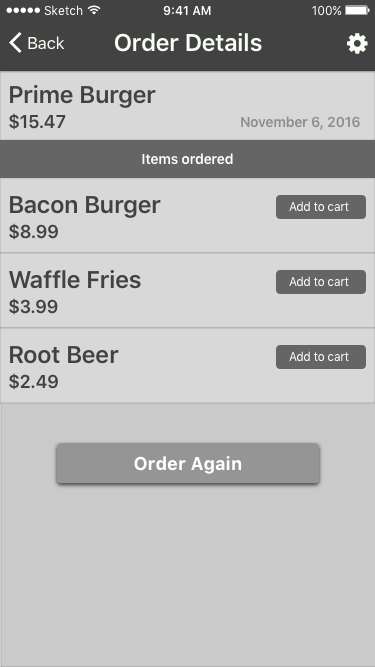
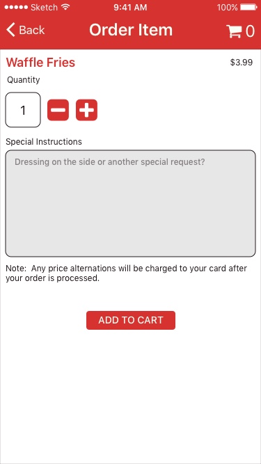
| A User | I want to select menu items for purchase | Purchase | Select menu item and add to cart |
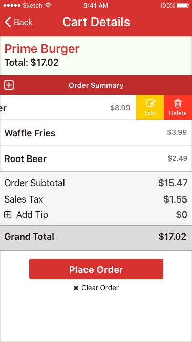
| A User | I want to edit my cart | Cart | Swipe cart item and click edit or delete |
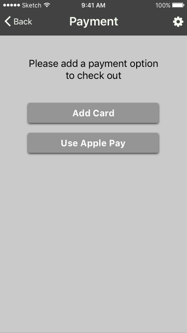
| A User | I want to complete my purchase | Details screen | Cart details screen place order link |
| A User | I want to select my payment option | Payment screen | Place Order |
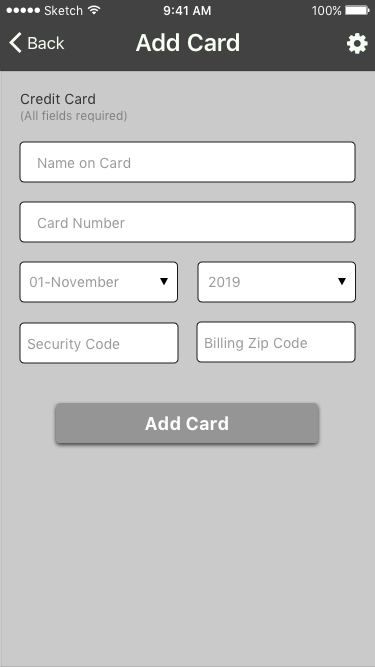
| A New User | I want to enter my credit card information | Add card screen | Add Payment option |
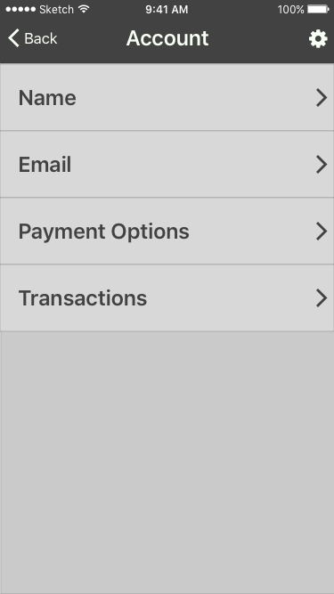
| A User | I view my account information | Account screen | Accoung cog link |
| A User | I want to view my transactions | Transactions screen | Account screen transactions item |
User Flows
From the user stories, I created a user flow diagram to help visualize how the customers would find trucks, learn about them, and place an order.
Wireframes
From the user flow diagram I designed low-fidelity wireframes. I realized through this process that a map would be important for locating trucks. I also realized that although this is an iOS app that users might not have Apple Pay set up so I added the option of using a credit card for payment.
Mockups
UI Elements
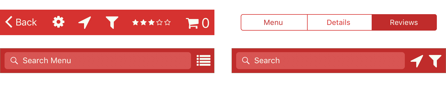
For consistency and familiarity, I used a number of stand UI elements and the iOS SF font.
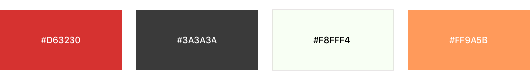
Color Psychology
Red is known to invoke hunger so I chose it as my primary color. I used a light shade of yellow as the secondary color since it is warm and also can stimulate the appetite.
Mockups
Conclusion
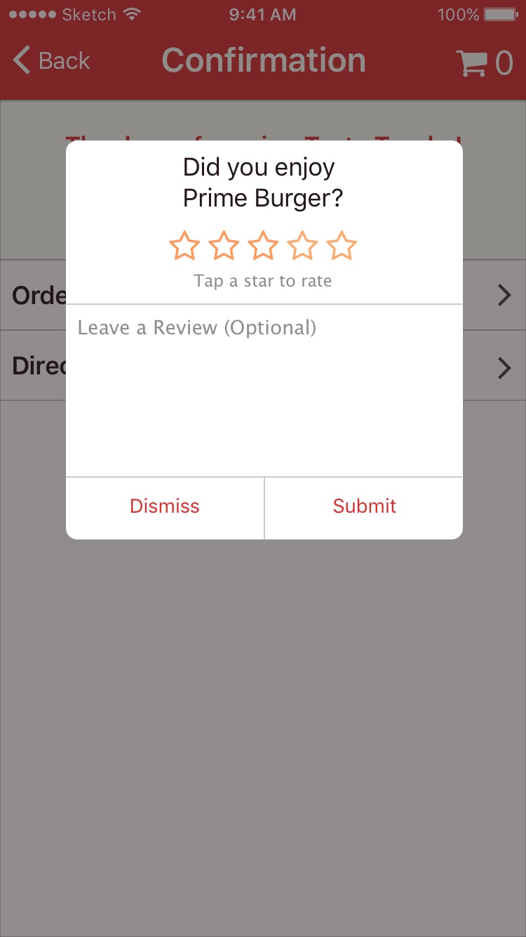
While designing Tasty Trucks I learned about the iOS UI elements and where it is best to use them. I also learned that by using swipe gestures I can reduce clutter on the screen as in the case of when the user swipes a cart item and gets to edit or delete the item. Or when the user scrolls up on the truck list so the list expands close to the top of the screen.
This iOS application was designed using Sketch.