RG
Mini Cart Redesign
A mini cart redesign for The North Face and Vans.


The Problem
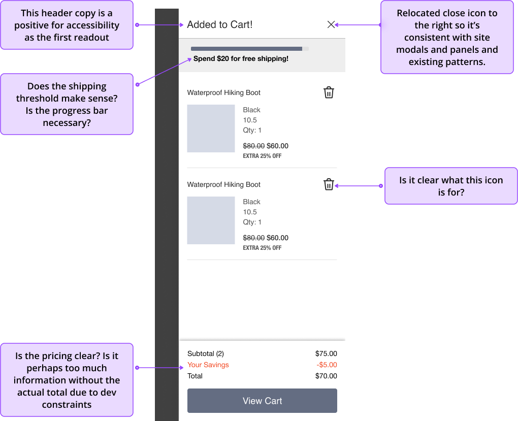
Our brand partners identified several issues with the existing mini cart. For example, customers were unable to remove items from their carts, the close icon was not positioned in a typical location, and there was concern that having two call-to-action (CTA) buttons increased cognitive load for users. Our goal was to address these problems and improve the mini cart's functionality to help improve conversions.
The Solution
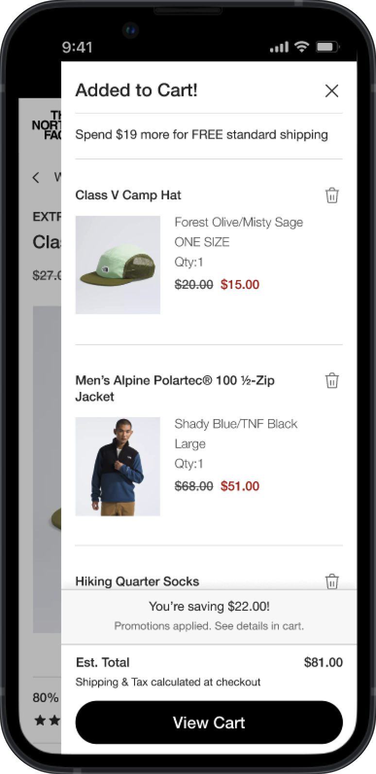
North Face
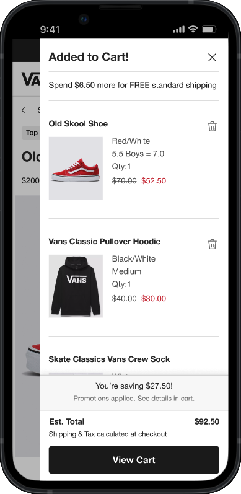
Vans
All designs owned by VF Corporation
The Process
Competitive Analysis
Our research team conducted a competitive analysis, charting the mini cart features utilized (or not) by 12 similar companies. We found that there was no consensus among the brands regarding the features they implemented. This information guided our design decisions and highlighted the necessity for usability testing.
Ideation Workshop
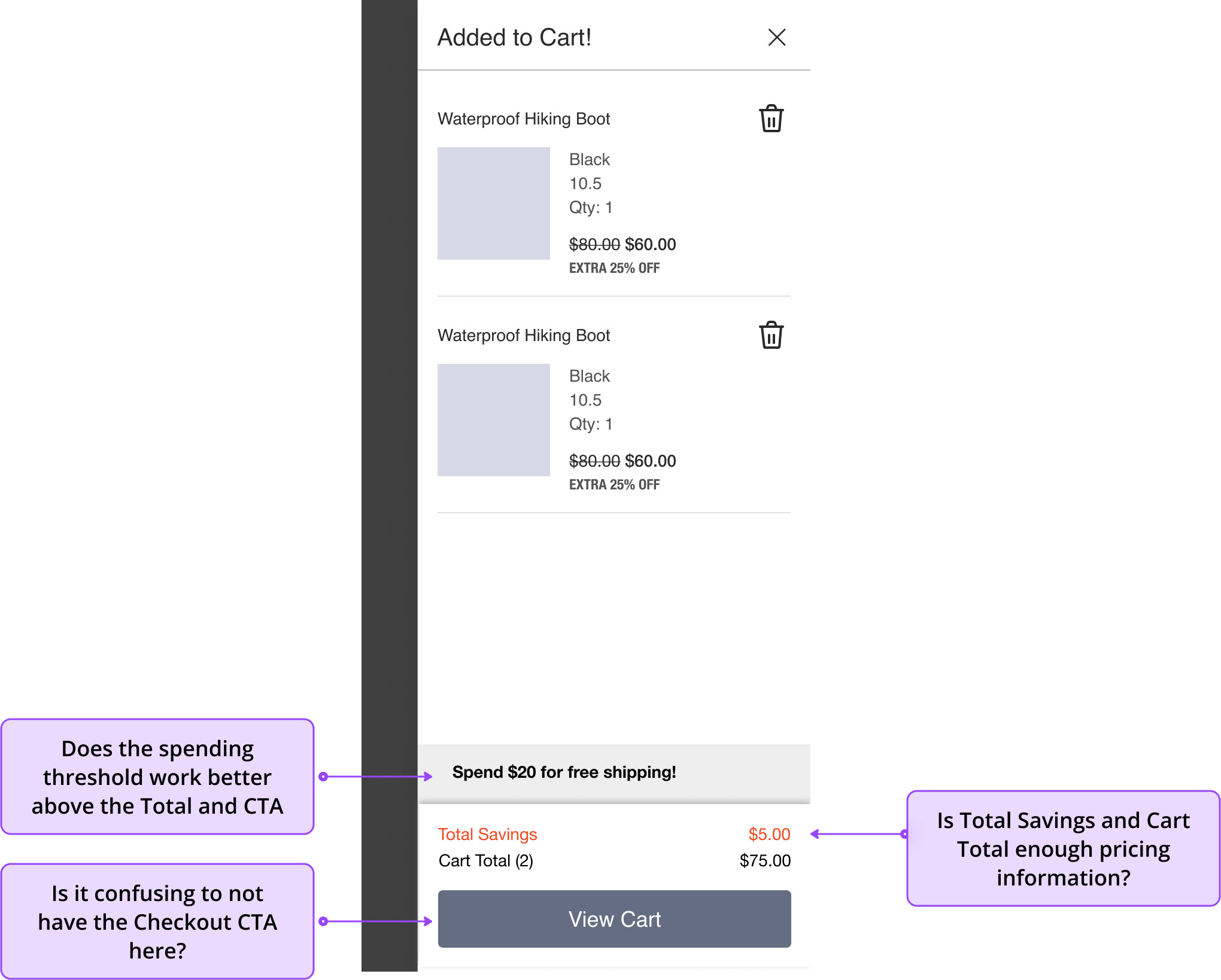
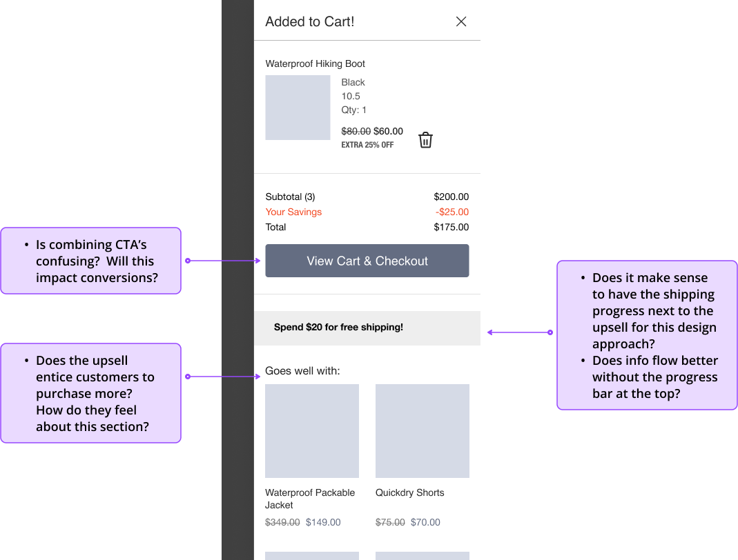
We conducted a collaborative ideation workshop to explore various design solutions in real-time with stakeholders, developers, and the product owner. We emerged with solid ideas and some questions.
Key areas of focus:
- Mini cart header
- Free shipping threshold
- Delete functionality
- Savings messaging
- Cart vs Checkout CTA
- Upsell section
A few sample designs from the workshop:
Lo-Fi Prototypes for Usability Testing
We iterated on the workshop designs to ensure all requirements were met. We then produced low-fidelity clickable prototypes for usability testing.
Concept 1
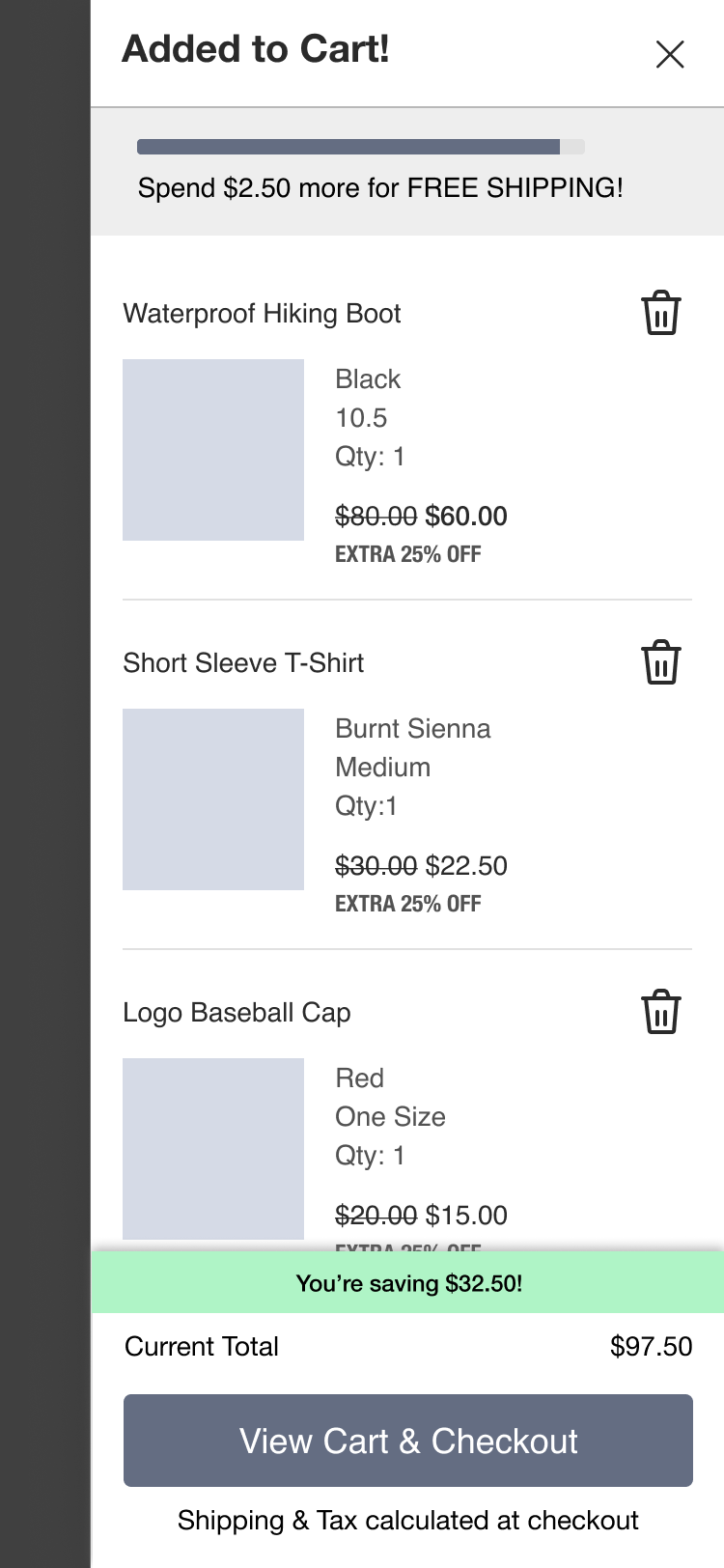
Concept 2
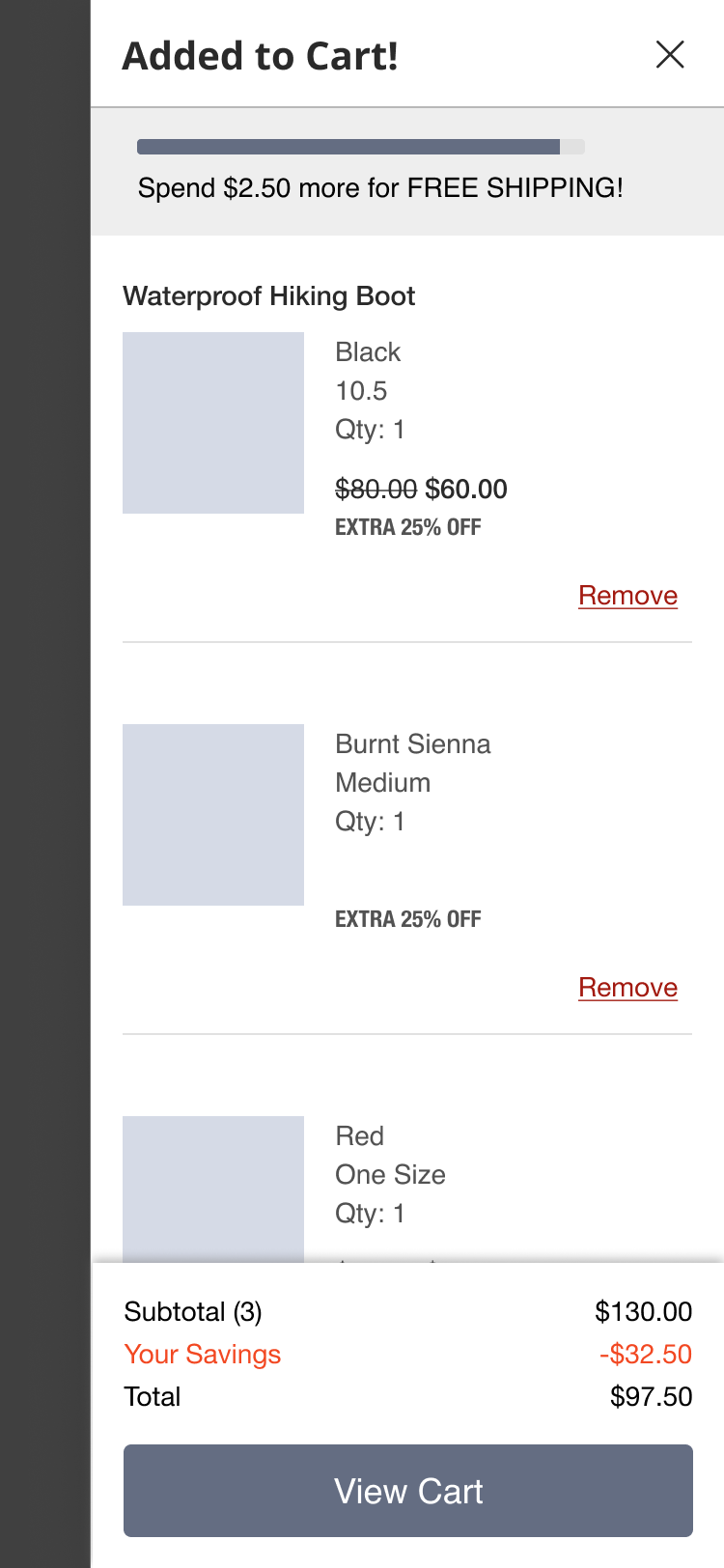
Concept 3
Concept 4
Lo-Fi Usability Testing Results
Our researcher assigned to the project conducted testing and synthesized the results. Concept 1 emerged as the most usable and easily understood design.
Key areas of focus results:
- Mini cart header
Users clearly grasped the header message, and closing the mini cart panel posed no challenges.
- Free shipping threshold
The savings threshold was clear to users, and testing showed no confusion.
- Savings messaging
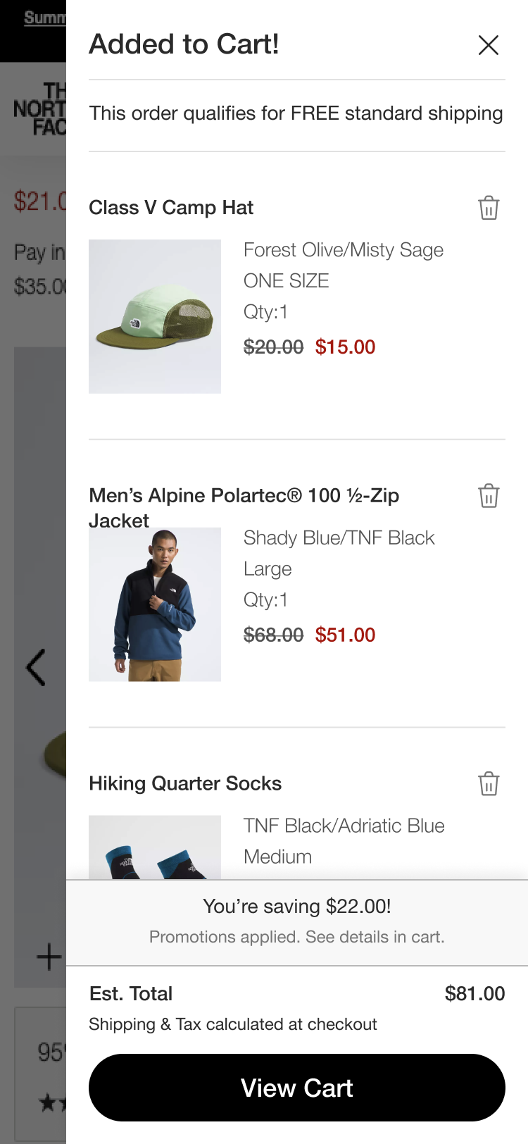
The savings message was effective, as users appreciated its emphasis. It was one of the key pieces of information they wanted to see in the mini cart. Users also valued the confirmation that the product had been successfully added to their cart.
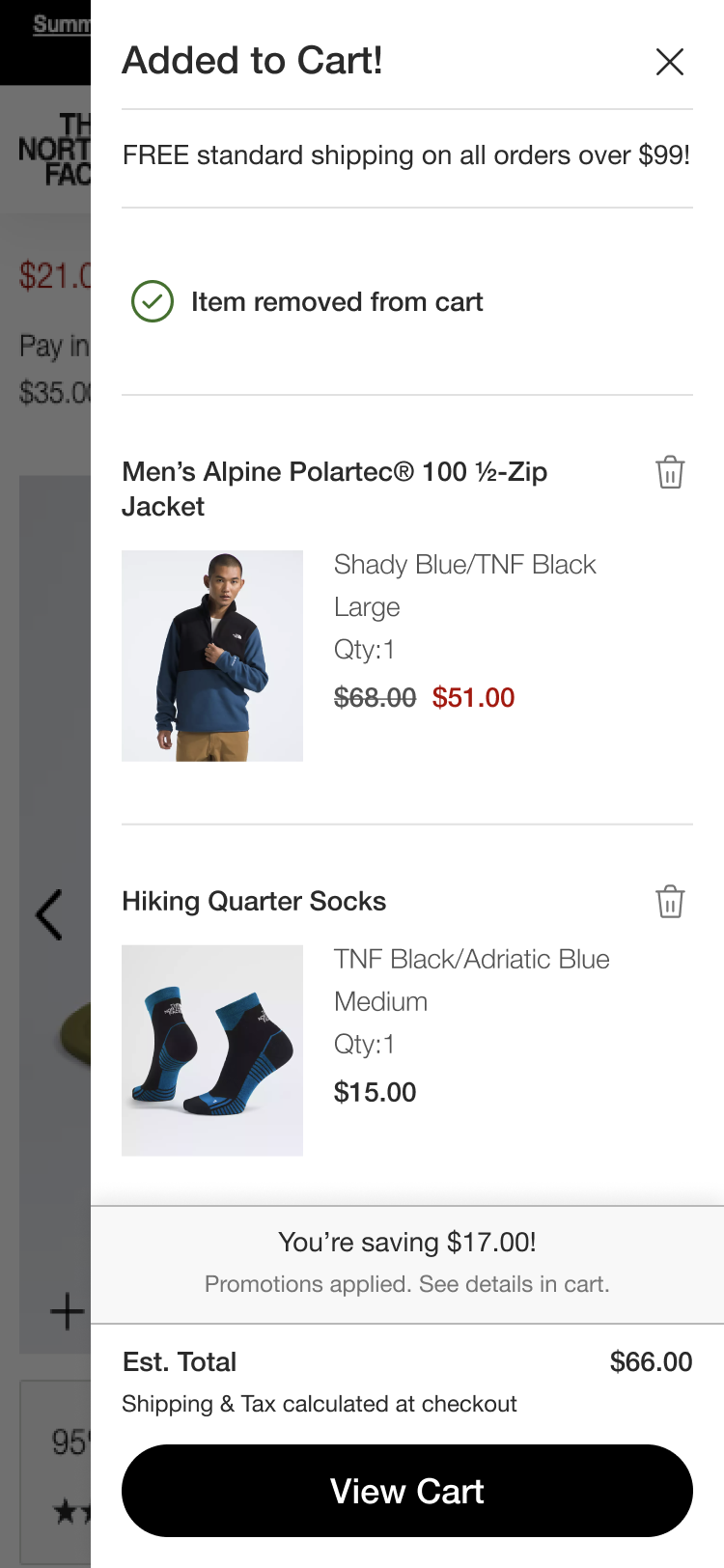
- Delete functionality
The delete icon performed well in testing, as users were familiar with it, eliminating the need to use the "remove copy" option.
- Cart vs. Checkout CTA
Most users preferred visiting the cart before proceeding to checkout. Based on this information and discussions with stakeholders, we decided to move forward with a single View Cart call to action.
- Upsell section
Users indicated that they would only consider upsell items if their prices were low enough to meet the free shipping threshold. In other words, they wouldn’t purchase a $100 product if they only needed an additional $15 to qualify for free shipping. Due to development constraints, the team decided to remove this feature for the current phase but will consider it for future enhancements.
Branded Mockups
Both The North Face and Vans use the same base design system so the mini cart UX is the same for both brands.
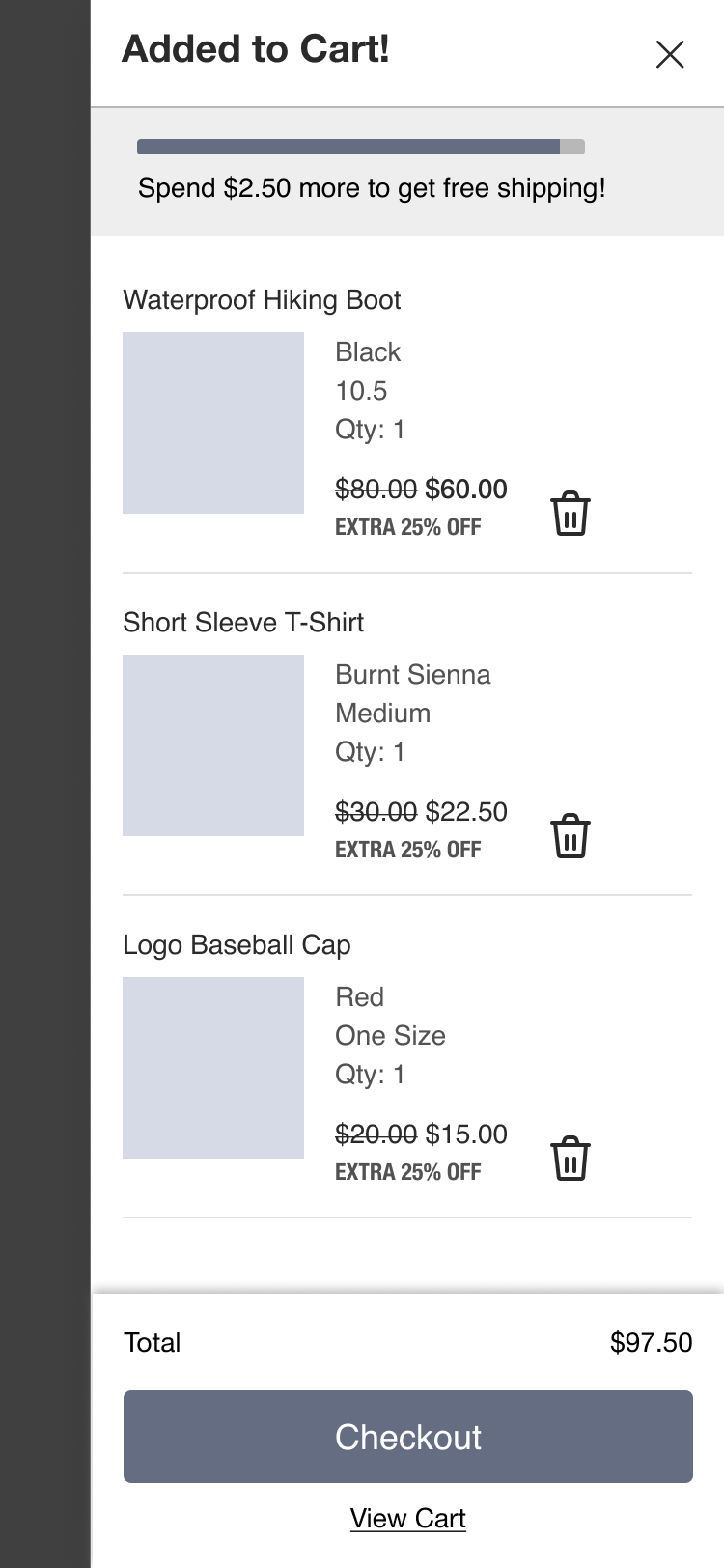
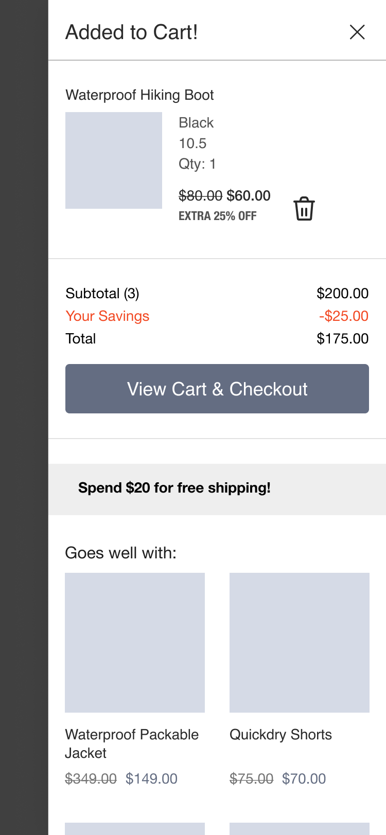
The North Face
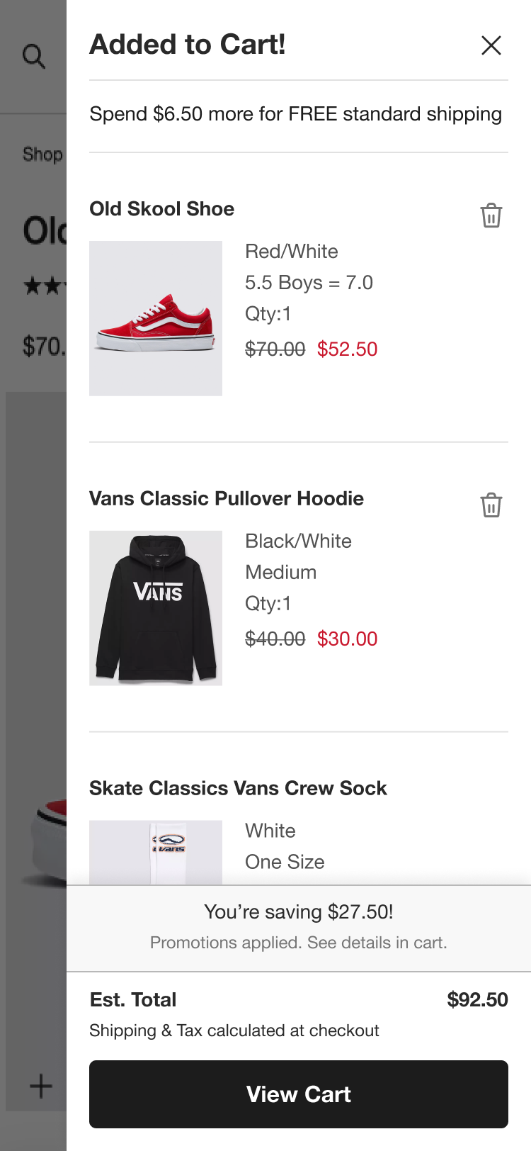
Default Mini Cart
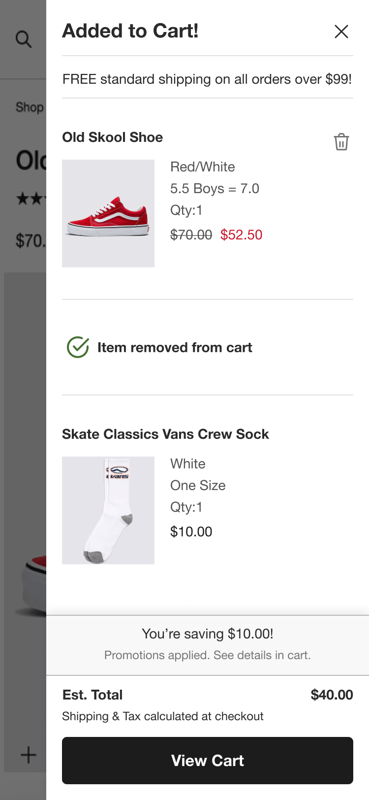
Deleted Item
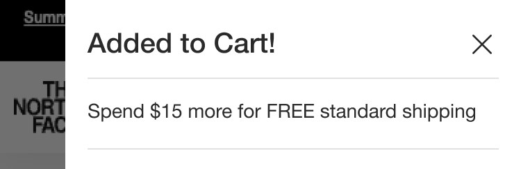
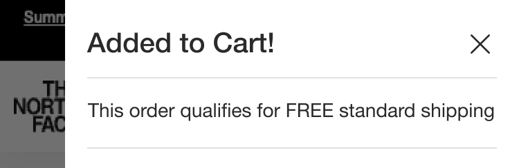
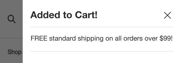
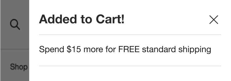
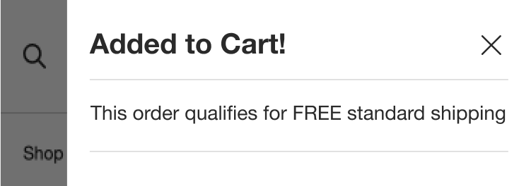
Shipping Threshold Variations
$20 Threshold is recommended based on research findings.
Below Threshold

Above Threshold
Reached Threshold
Vans
Default Mini Cart
Deleted Item
Shipping Threshold Variations
$20 Threshold is recommended based on research findings.
Below Threshold
Above Threshold
Reached Threshold
Conclusion
We conducted another round of usability testing with branded prototypes for further validation. The designs performed well and received positive feedback from most users. I provided annotaions for the developers and worked with them to make sure the code was pixel perfect before going live. Overall, the project was a collaborative success. Our team brainstormed design solutions and conducted qualitative usability testing to confirm that our design decisions met user needs. The updated mini cart is now live on The North Face and Vans websites. The brands will monitor its performance and make any necessary adjustments.
All designs owned by VF Corporation